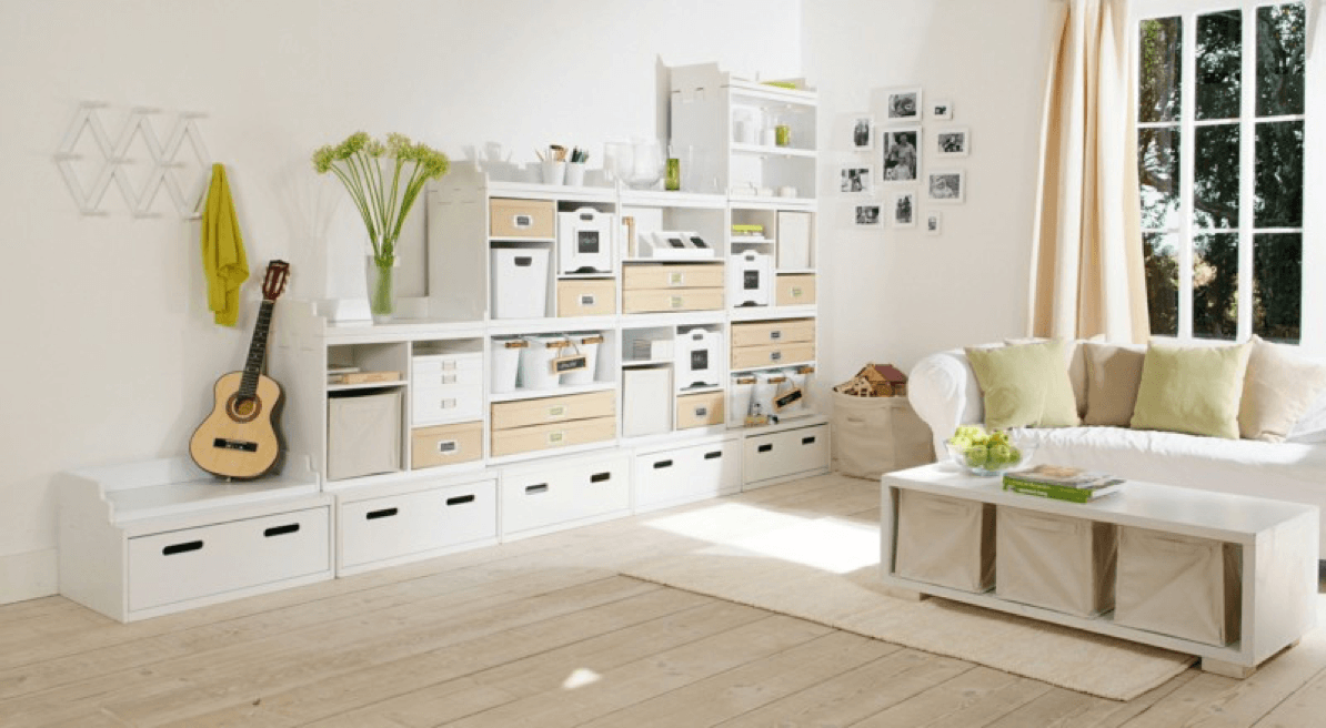
If you live in a condo or an older home with the original floor plan, chances are your home is space challenged. If you’re lucky and have the time to...
Category: Interior Design Tips
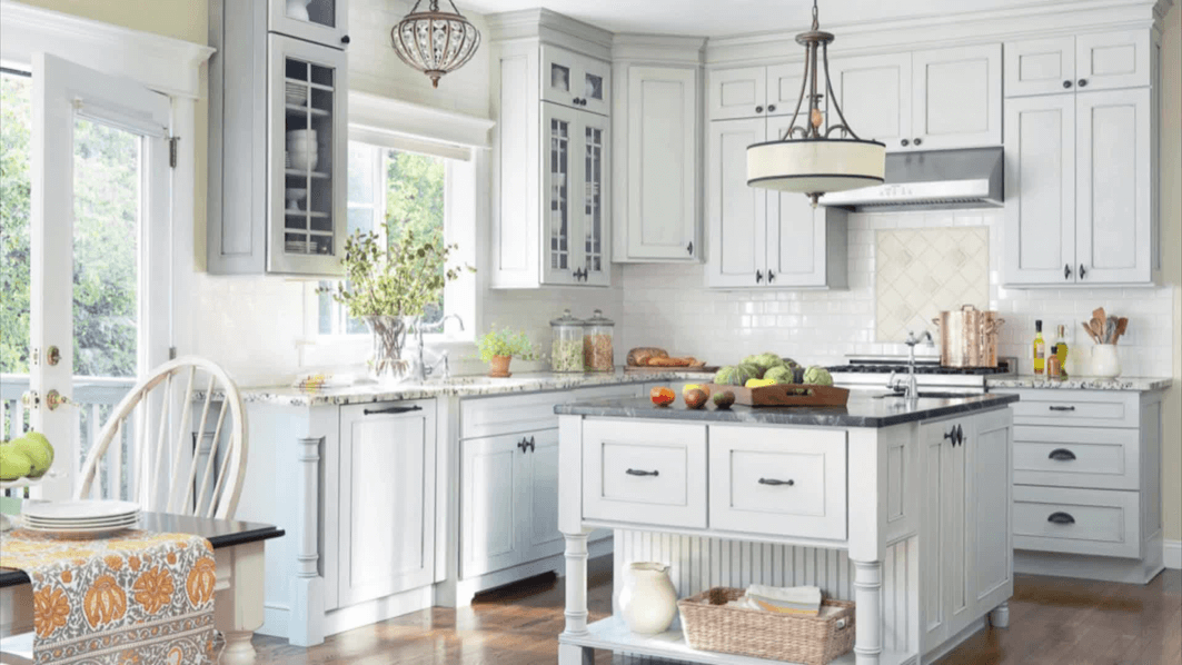
If you are considering a kitchen renovation, keep in mind that the design focus in the room will be the kitchen cabinets and the single largest surface to cover is...
Whether you’ve just moved into your new home or you’re renting a temporary space, it’s important to add some personalization and make it yours. Instead of spending hours pouring over...
From the lightest whites to the warmest caramels, TORLYS has a wide selection of light hardwood and laminate flooring that will open up any space and make your home feel...
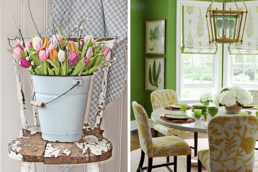
Enough with WINTER! The calendar says March, the clocks have moved ahead and retail stores are brimming with Easter goodies! We should be enjoying the freshness of SPRING not shovelling...
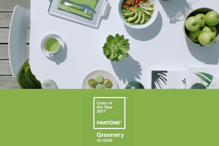
It’s the most wonderful time of the year! Pantone has introduced its 2017 Color of the Year: Greenery. And guess what? We love it. But how do you work a...
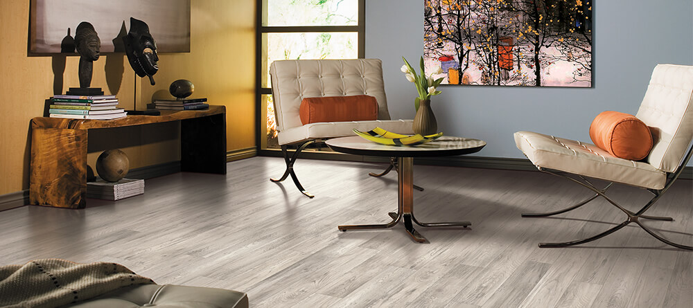
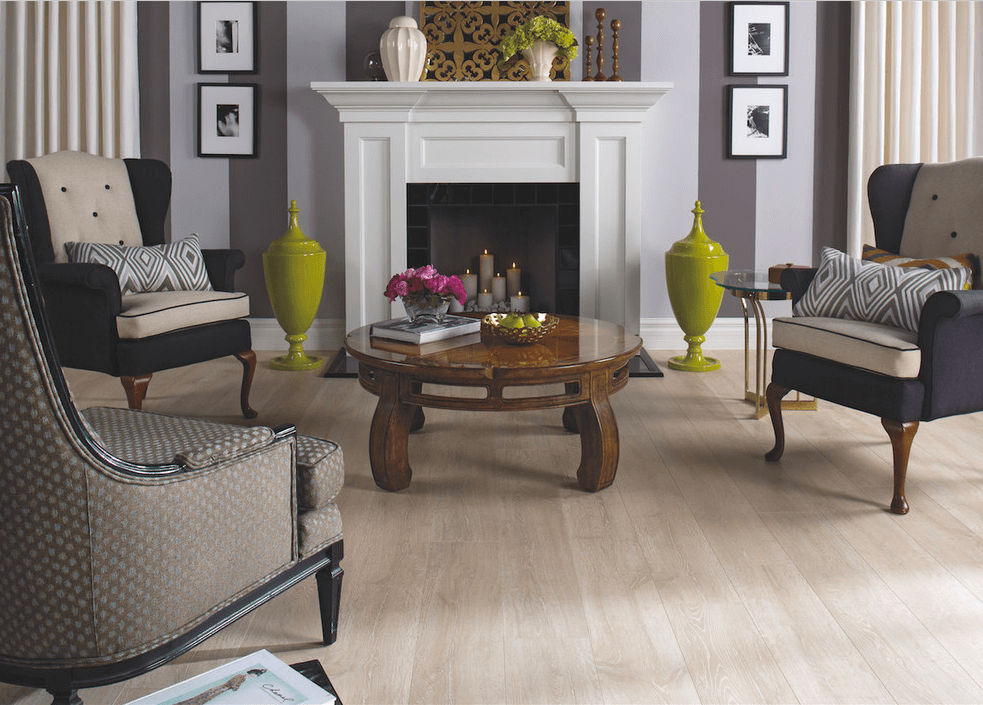
Grey hardwood or laminate flooring is versatile. Its clear, glassy appearance enhances natural light, opening spaces to make rooms feel airy. While a grey floor looks delicate, scratches and stains...
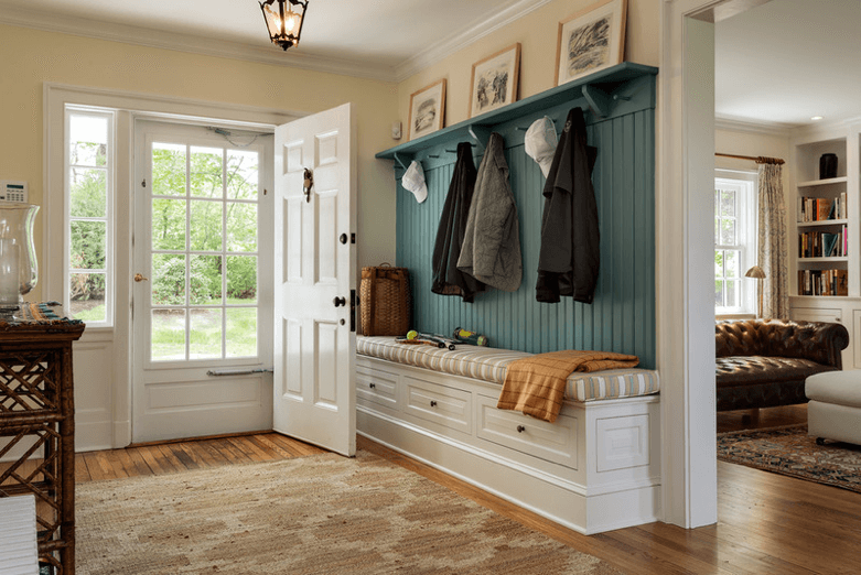
Who says functional, utility spaces must look like the inside of the garage? We all need a front entrance that can handle the kids and the dog on a rainy...
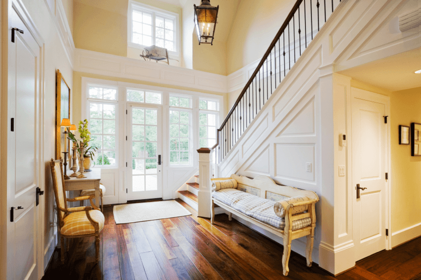
Welcome Home! The design of a home’s front entrance carries the responsibility of making that critical “first impression”. This space must welcome guests, offer enough space to easily remove coats...
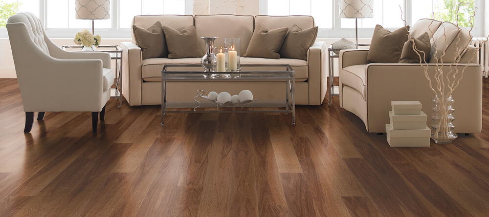
Dark flooring is dramatic and breathtaking, but when paired with unflattering furniture and accents, a dark floor can make a room feel claustrophobic and heavy. Follow these tips to open up...