Whether you’ve just moved into your new home or you’re renting a temporary space, it’s important to add some personalization and make it yours. Instead of spending hours pouring over mountains of magazines to determine what you want your space to be, follow the latest “anti-design” trend and personalize your space.
In the 1960s it was called bohemian style, in the 1990s it was called “eclectic living”, and today we call it “curating your space”. If you search either term, the same design styles will appear because although the names are different, the rules are the same: create a space that expresses your personality and lifestyle.
This means personalizing your space to make it about what you like and putting your lifestyle first. So if you’re a bookworm, you might have a jumbled space with walls covered in bookshelves. And if you’re someone who loves the opera, you might have framed posters and memorabilia around your home. Either way, express who you are.
How to Personalize Your Space
Getting the eclectic look can seem confusing because it doesn’t follow a set list of rules. Follow these simple tips when designing your curated space while keeping your needs and passions in mind and your personalized space will come together perfectly.
- Make your space all about you
- Mix different textures (ie. leather, wool, cotton, silk)
- Don’t buy matching furniture sets
- Use pieces from different eras
- Practice balance — eclectic style doesn’t mean anything goes
- Don’t worry too much about symmetry
Find Your Focus
Don’t be shy or conservative with your choices. It is fun to add a significant or dramatic accessory that is your statement piece and that represents your lifestyle.
If you love the outdoors and cycling, hang your bike vertically on the entry hall wall. If music is your first love, cover the walls in sheet music, album covers, and vintage instruments.
How to Pick Patterns and Textures
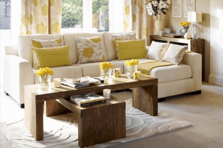
Once you know what you’d like your space to focus on, it’s time to decide on a colour family (brights, neutrals, pastels, etc.) and a pattern and texture preference. If you never tire of colour and graphic patterns, keep your colour theme saturated and bold.
Start looking for textiles, artwork, and accessories that compliment that theme. Remember, your space is about function, so the comfort level of the textures you choose is key to your room. Stay soft and tactile.
How to Arrange Your Furniture
The shopping, collecting, and rearranging never ends with a personalized space. Just as we change our minds, we change our interior décor. As you are pulling your space together, stop frequently and assess your progress. The space should make you feel 100% at home, happy and totally comfortable. The only rule you shouldn’t break is to be true to what you like.
Examples of Personalized Spaces
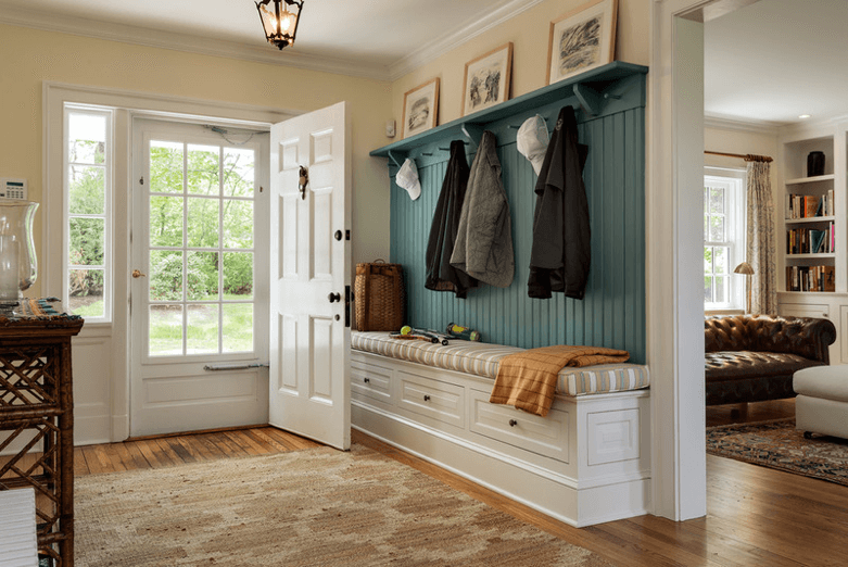
1. Personalizing Your Space for Life, Work, and Play
The formula to personalizing your space is simple. The arrangement of the décor should suit how you have always wanted to live, work and play. If reading is your passion, then book-lined walls, floor lamps and big comfy chairs should be the focus; not a formal sofa or china cabinet.
Function over Design
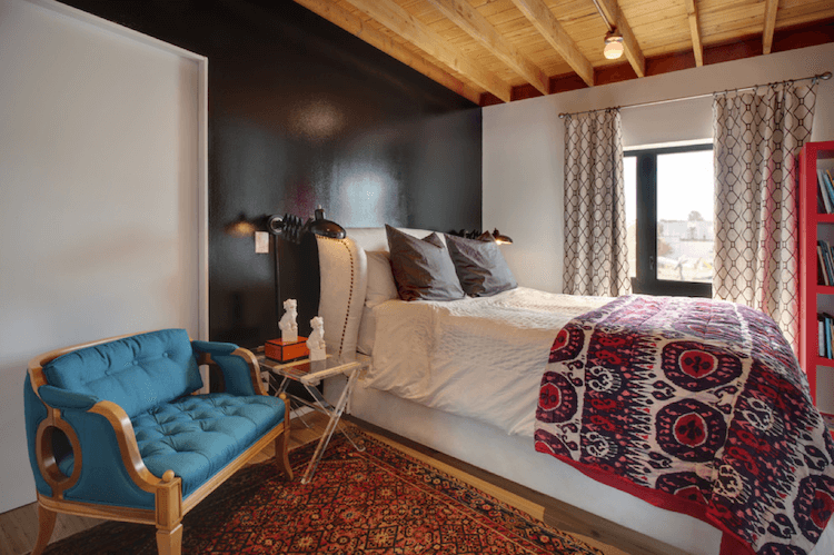
The space is not large so the décor is set up to maximize personal comfort. The bed is positioned to take advantage of the view; lighting and wall shelves reflect an avid reader; and the colour story is classic and timeless. The small settee creates an ideal spot for reading if it is not quite time for bed. Image from Rize Studos.
Design to Entertain
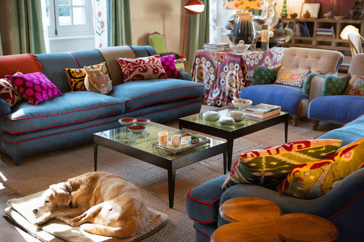
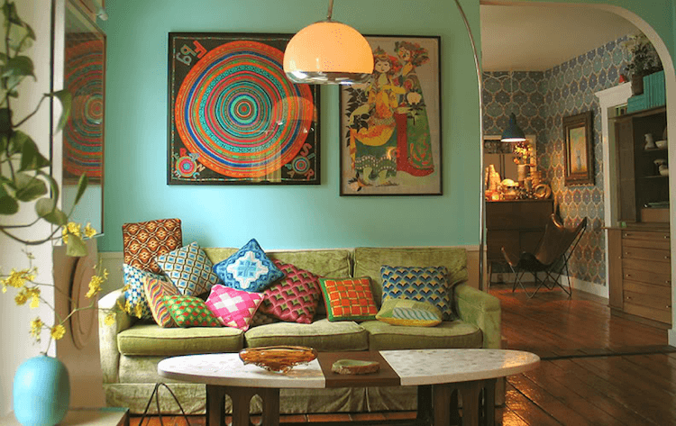
This space is an ideal set up for entertaining guests. There are lots of seating options; no one sits outside the circle (including the family pup); and everyone has a spot for cocktails and munchies. The interior design reflects a boho feel with lots of mismatched colour and print. You can imagine the fun, expressive personality of the owner. Image from Aleteia.
2. Design by the Decades
Choosing an era or decade can be helpful for personalizing your space. If you have always liked the 1960’s then shopping garage sales for mid-century modern furniture and accessories is the answer. Research the era and start collecting iconic pieces that speak to the decade.
Personalize Vintage:
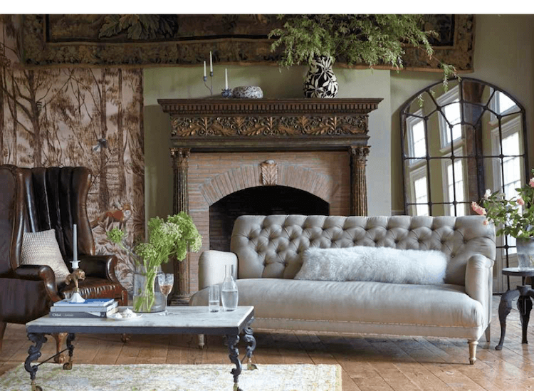
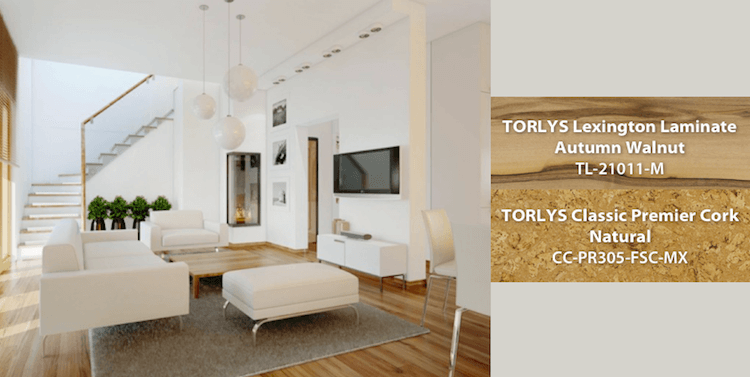
Every item within this room is rooted in traditional design and, if set up in perfect symmetry, the decor would feel old and stuffy. However, because the items are large in scale and positioned asymmetrically (off line), the room has a contemporary, over stuffed feeling of comfort.
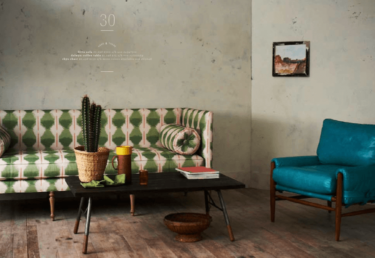
Mid-Century Statement:
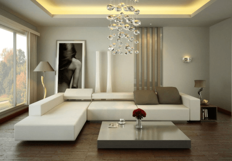
If the 50’s is an era you love, this space is perfect. The bold use of colour and pattern showcase the vintage furniture. The sparse use of artwork and accents reflect an “anti-design” attitude. The contrasting cement wall finish and distressed floor provide the perfect contrast. Definitely a one-of-a-kind living room. Image from Anthropology Home.
3. Picking Patterns and Textures
Once you have a focus, then decide on a colour family (brights, neutrals, pastels etc) and a pattern and texture preference. Start scouting textiles, artwork, accessories that compliment that theme. Texture is important. If comfort is key to the room, then textiles should be soft and tactile. If retro modern is the direction, then high gloss finishes and geometric shapes are key.
The shopping, collecting, and rearranging never ends with a personalized space. Just as we change our minds, so does our interior décor. As you are pulling your space together, stop frequently and assess your progress. The space should make you feel 100% at home. It should make you feel happy and totally comfortable. The only rule you shouldn’t break is to be true to what you like.
Don’t be shy or conservative with your choices! It is fun to add a significant or dramatic accessory that is your statement piece. If you love the outdoors and love to cycle, then hang your bike vertically on the entry hall wall. If music is your first love, cover the walls in sheet music, album covers, and vintage instruments.
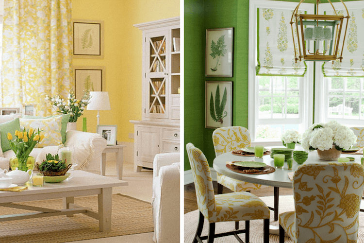
Love of Colour and Print:
If you never tire of colour and love graphic patterns this space is a perfect personal reflection. The colours are saturated and bold without being too loud. The prints do not match, but they flatter each other and create a creative energy in the space.
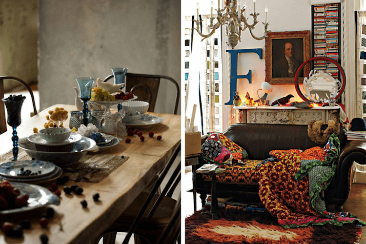
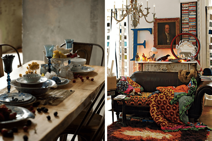
Mix and Match (above left):
Personalize your brunch buffet or a seasonal table display by breaking the rules and mixing and stacking different shapes of serve ware. Scattered fruit, cheese, and nuts for mingling guests to munch on prior to the main meal. The mix of stemware with lower profile plates creates a better landscape. Add candles and flowers for a special occasion.
Bold Decisions (above right):
The giant “E” on the mantel could reflect a name or represent what they were going for like – “enjoy” or “everything (I love) ” There is no rhyme or reason to the décor except the scale, texture, and colour scheme are bold. It’s all vintage, but the era’s are 100’s of years apart. You could define the personality of the owner as confident and “one of a kind”. Images From Anthropology Home.
Personalizing Your Space
The names are different but the rules are the same: personalizing your space is all about what you like and putting your lifestyle first. Find your local TORLYS dealer to create the perfect backdrop for your personal style!

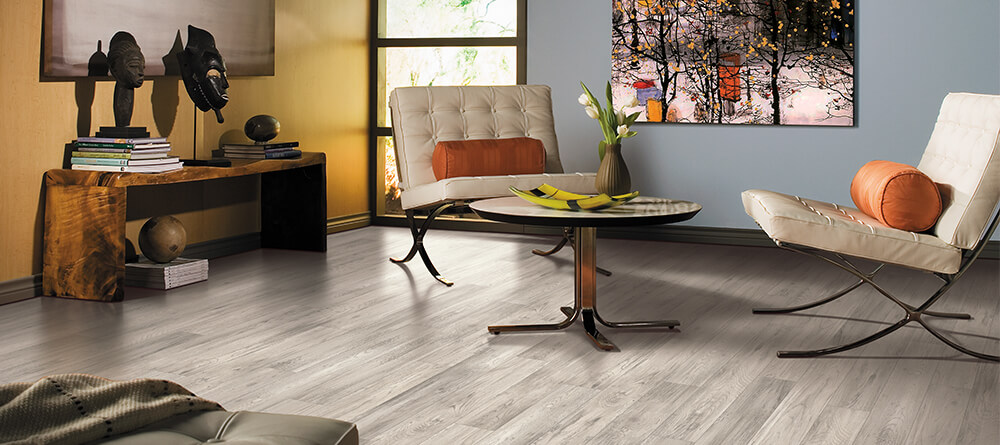
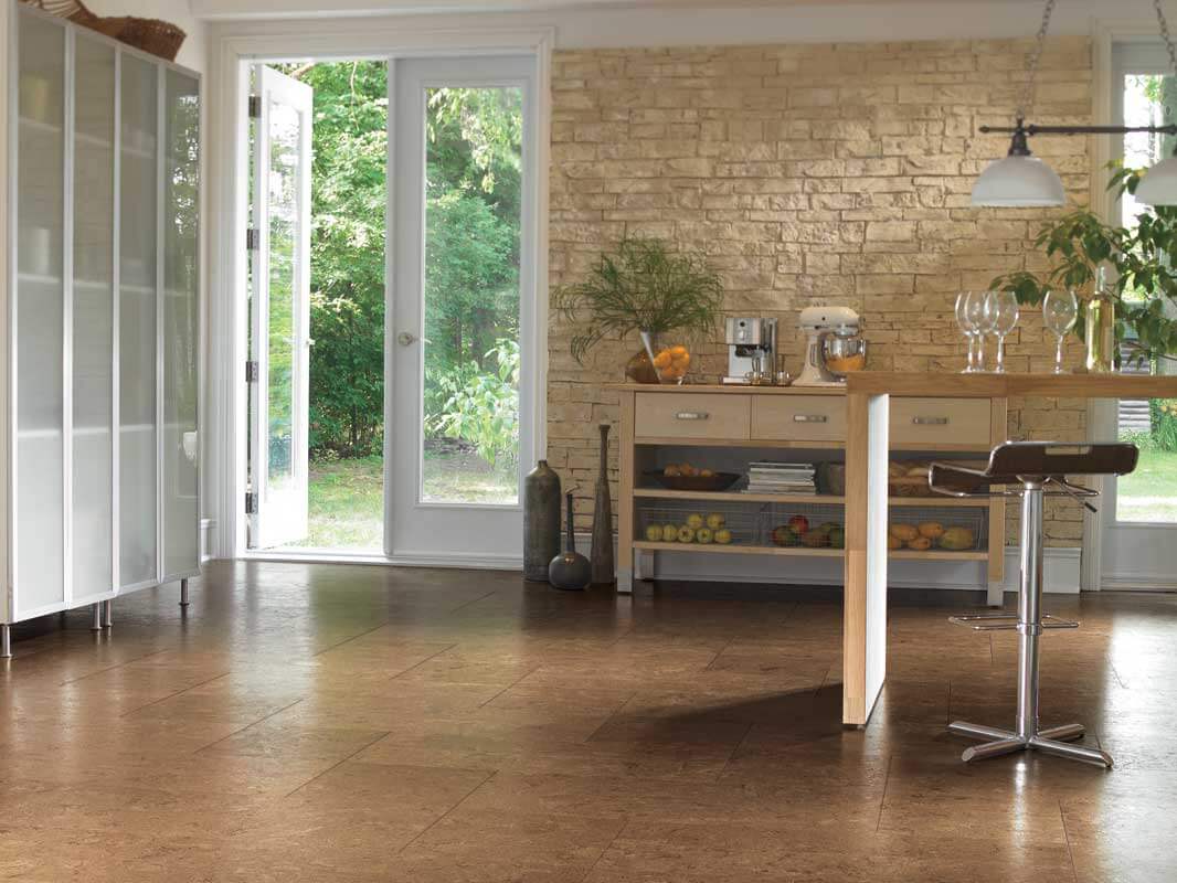
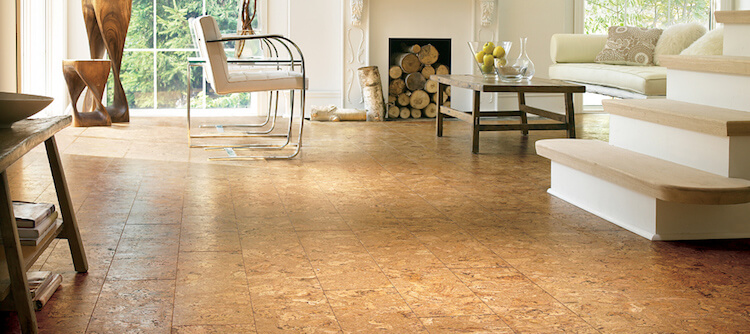
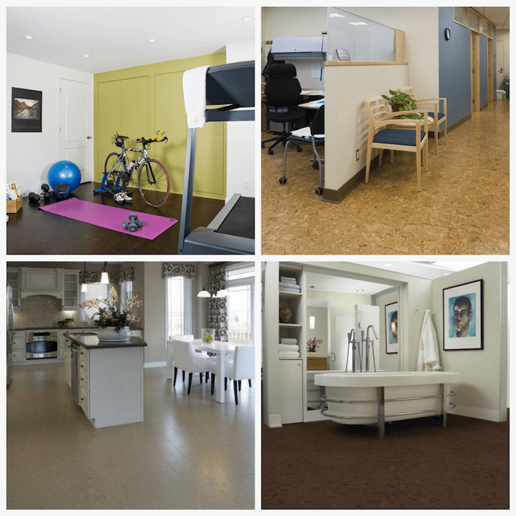
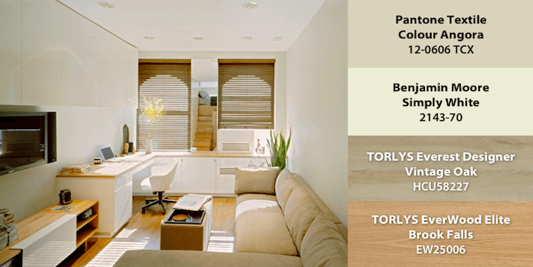
 The Durability & Comfort of Corkwood
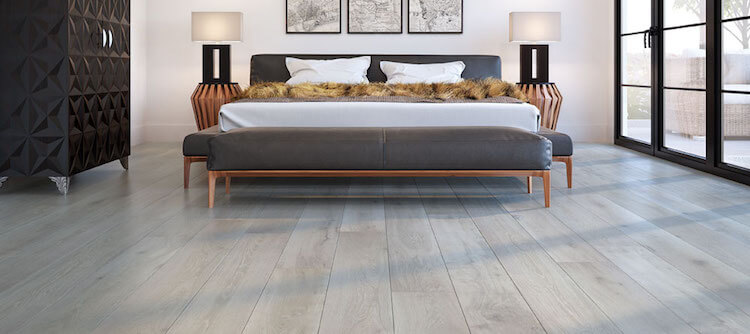 Styling Corkwood
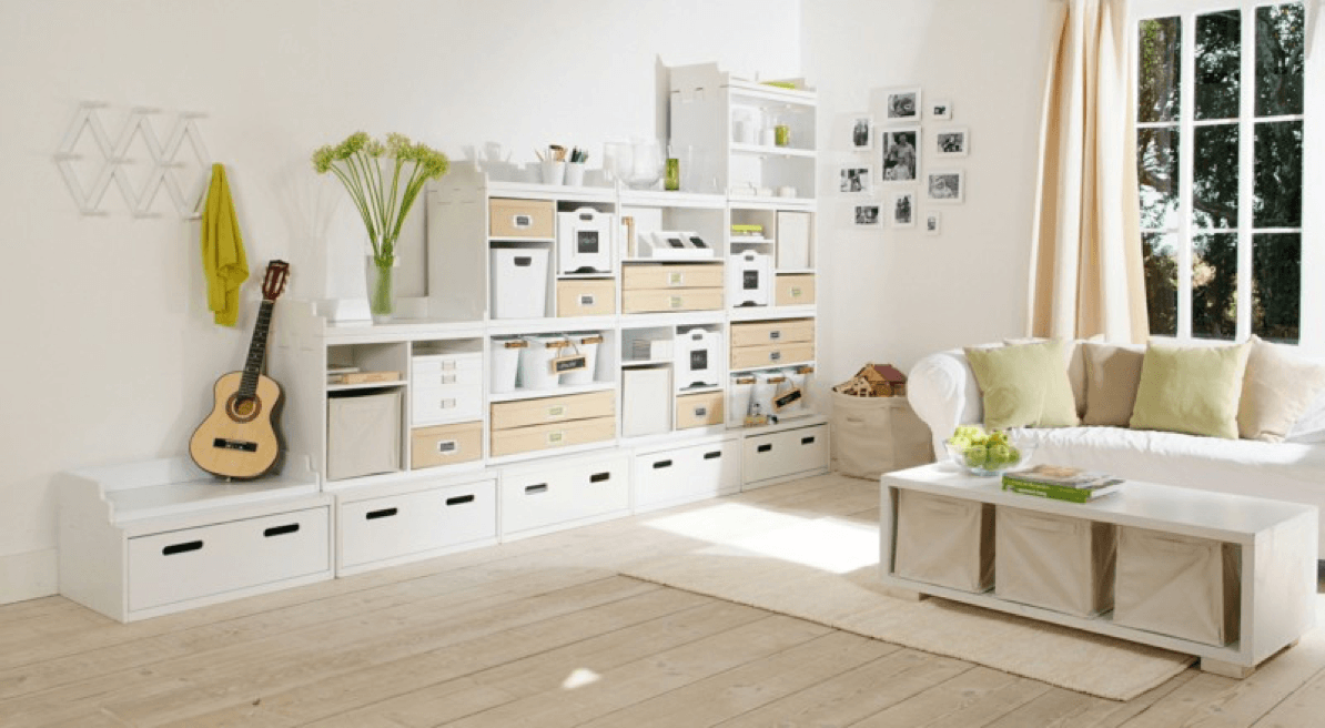

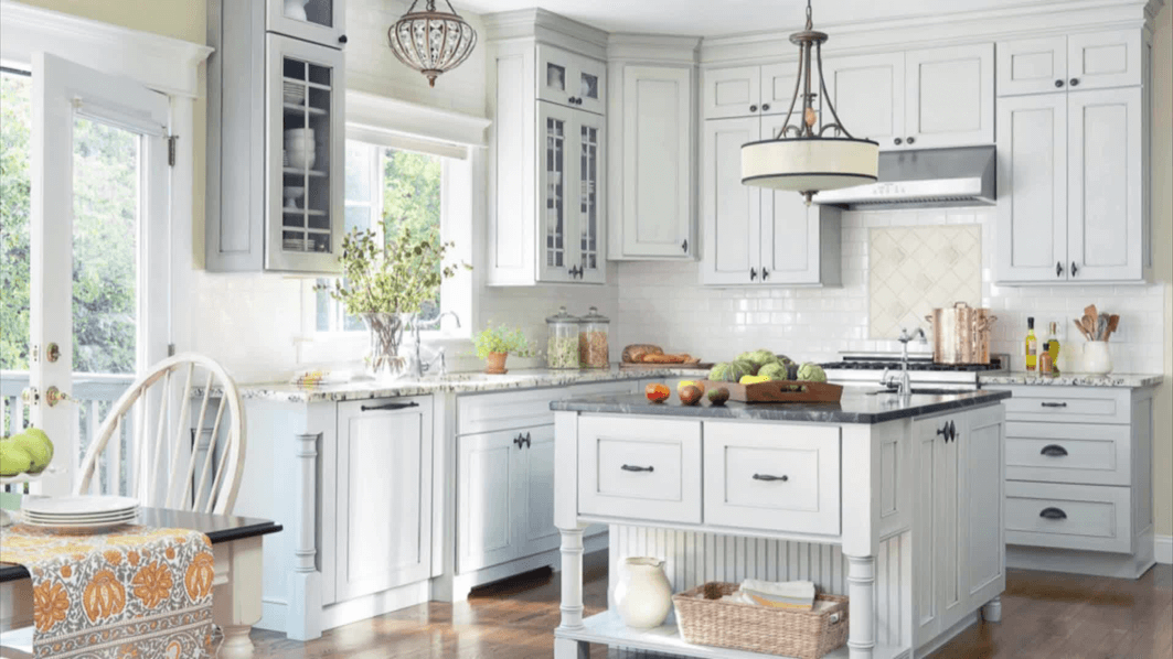
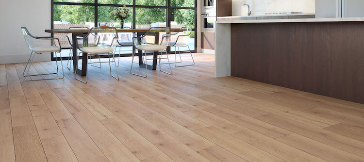
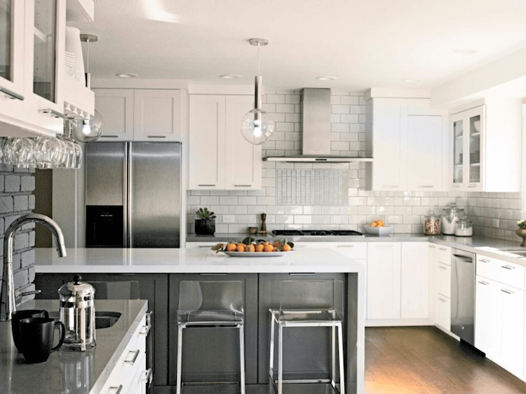
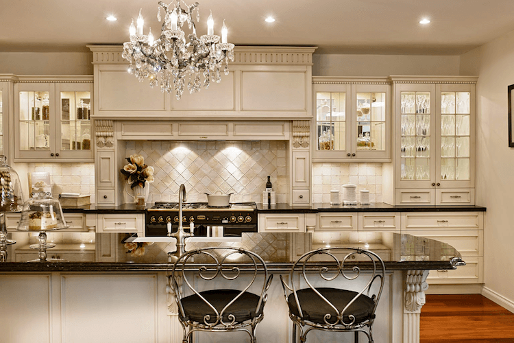 The drama of high contrast will also create a feeling of glamour in a traditional kitchen. If the kitchen cabinets are a rich creamy finish and ornately detailed with lots of sparkling glass, try a contrasting hardwood floor and stone countertop in deep charcoal or chocolate.
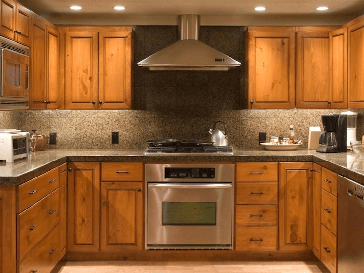
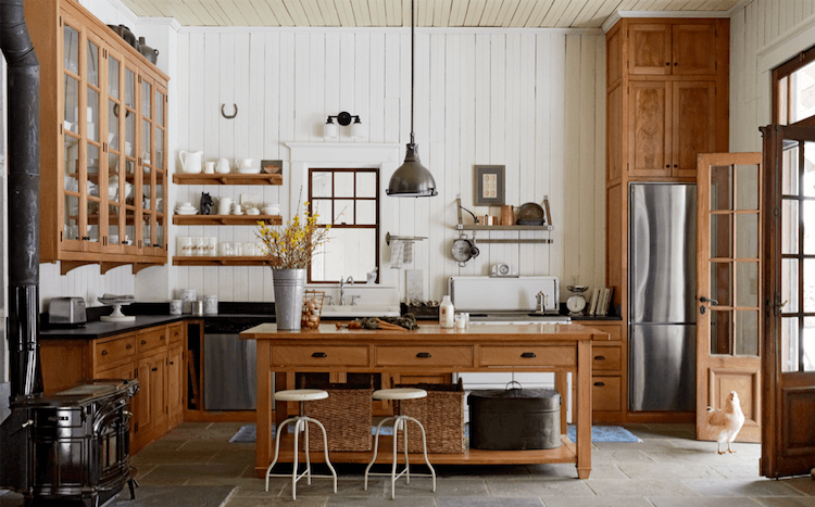 Whitewashed oak, maple or pine are perfect kitchen cabinet choices if you are trying to create a French country kitchen. A white transparent stain over natural wood creates a vintage quality making grey and antique white a perfect colour scheme. Grey stained wood floors are the latest trend and there are lots to choose from.
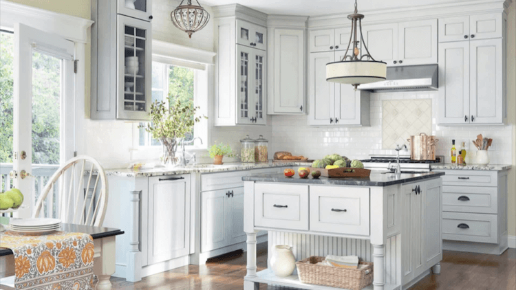
 Wood on Wood
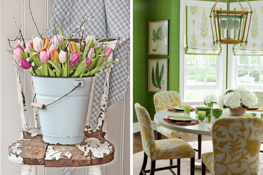
 Natural Trend Inspires Spring
 What changes are you making in your home for spring? Share your photos over on our Facebook page!